Hello,I’mAnkurMishra.

Get in touch.

+1 510 5135368

ankur1999.mishra@gmail.com

San Ramon, California

Portfolio

Selected Works 2020–2026
↓ Scroll
01-01Print & Branding

Golden Gate Event Poster

Project Goal:

The Golden Gate Park Events Poster is a project that tackled, advertised, and announced unique public events taking place in October at certain locations around Golden Gate Park.

Summary:

The purpose of this project was to create a poster for the Golden Gate Park events for October 2019. Carilliantine Solid and Futura PT were used during this process. Carilliantine Solid was used for the heading and a variety of Futura PT was used for everything else. Different weights of Futura PT were chosen to contrast different information as well as create visual hierarchy. For example, Futura PT is used in the location of the events as well as the main text, but weight and size are used to create a contrast between the two. The events go in chronological order from the earliest date to the latest and breaks are used in between each week. Color is added for more contrast between the text, the numbers, and the titles. I chose colors like red and white to represent the Golden Gate Bridge. Finally, a black background was used to make the red and white pop.
Applied Skills:
Layout, Typography, Vector, Color Theory
Made With:
Adobe Illustrator, Adobe InDesign, Image Trace, Adobe Photoshop
01-02Print & Branding

Book Cover Redesign

Project Goal:

Pick a book that is meaningful to you and redesign its covers in a way that reflects the story and entices people to read it. The book you choose to redesign can be anything from children’s books, to textbooks, religious texts, cookbooks etc. We will be presenting our designs as professional renderings that show the front, back and side of the book.

Summary:

The goal of this project was to redesign a cover that expresses the mood, concept, and/or theme of The Great Gatsby. A theme of The Great Gatsby that I heavily relied on for this project is that of the 1920s. This is shown in the front cover, where a recreation of the Art Deco style has been taken from. The cover is also symbolic imagery of the Empire State Building, as the book is set in New York. The cover also looks like a party invitation. Finally, the use of lines and the colors teal and gold make it look like a piece from the 1920s.

Applied Skills:
Layout, Typography, Vector, Color Theory
Made With:
Adobe Illustrator, Adobe Photoshop
01-03Print & Branding

CanAm Pizza Redesign

Project Goal:

To develop a consistent brand identity that resonates with both current customers and new markets. The focus is on enhancing customer relationships, promoting our unique flavors, and fostering a home-like experience.

Summary:

The purpose of this redesign was to make the brand cohesive and mature. The current branding was done in the 1990s, which makes them not stand out from the competition. The new rebrand makes them stand out.

Client:
CanAm Pizza
Applied Skills:
Layout, Typography, Vector Graphics, Color Theory, Brand Identity
Made With:
Adobe Illustrator, Adobe Photoshop
01-04Print & Branding

Tazo Tea RePackaging

Project Goal:

This project is a study of packaging and packaging series design. This project is a repackaging and series design of the brand Tazo Tea.

Summary:

The purpose of this project was to design three tea boxes for the brand Tazo. This project was approached with a mixture of graphic design and illustration. For this project, I wanted it to be minimalistic, so neutral colors were chosen for the background and simple drawings were used. The illustrations are of the ingredients of each flavor and were drawn as simple vector graphics. The color palette consists of colors that reflect the real fruits, flowers and berries of the illustrations. All these elements are used to create a product that is both minimalistic in its design but elaborate in illustrations.

Applied Skills:
Packaging, Typography, Layout, Vector Graphic, Color Theory
Made With:
Adobe Illustrator, Adobe Photoshop
01-05Print & Branding

Story Coffee Redesign

Project Goal:

This project focuses on the rebranding and identity of a local coffee business. It highlights the brand’s new logo as well as how that rebranding carries throughout many platforms of the brand. The rebranding consists of a logo redesign exploring color and typography options.

Summary:

The project involves redesigning the logo for a local coffee shop aiming to enhance its brand identity, appeal to a wider customer base, and reflect its core values and offerings. The new logo should be modern, memorable, and reflective of the shop’s unique personality, while staying true to its community roots.

Applied Skills:
Logo Design, Typography, Vector Graphic, Color Theory
Made With:
Adobe Illustrator, Adobe Photoshop
01-06Print & Branding

Indiofest

Project Goal:

This project is focused on creating a replacement music festival for Coachella.

Summary:

The Indiofest Valley music festival has become very popular throughout the years. The festival itself has been evolving, but the branding has been stagnant, with the logo looking the same since 1999. The goal was to make the branding look like the 1970s, since not many music festivals look like the 1970s, giving the festival a more outdoor and natural feel.

Applied Skills:
Layout, Typography, Vector Graphics, Color Theory, Brand Identity
Made With:
Adobe Illustrator, Adobe InDesign, Image Trace, Adobe Photoshop
01-07Print & Branding

The Corner Store

Project Goal:

The Corner Store is an imagined independent neighborhood market set in Park Slope, Brooklyn. In New York, the corner store is more than a place to shop. It’s where you grab coffee on the way to the subway, pick up eggs at 10 p.m. and catch up with the person behind the counter. This concept explores how a brand identity could celebrate that everyday ritual and give the classic bodega a brighter, friendlier look.

Summary:

Everything starts with the striped awning over the door, the one detail every corner store shares. Its scalloped edge and alternating stripes became the core of the system: they crown the logo, frame every layout and repeat across patterns, packaging and signage. The goal was a brand that feels familiar right away, but clean and modern enough to stand out on the block.

Applied Skills:
Logo Design, Typography, Brand Identity, Color Theory
Made With:
Adobe Illustrator, Adobe Photoshop
01-08Print & Branding

Tag Media

Project Goal:

Tag Media makes and distributes web shows for married couples. The shows are truthful, and they’re sold in stores worldwide. The brief asked for a yellow wordmark for the company website, one that feels innocent but still business-like.

Summary:

The idea comes from the name. A tag is the small label that tells you what something truthfully is, and that’s the brand’s whole promise.

Applied Skills:
Logo Design, Typography, Brand Identity, Color Theory
Made With:
Adobe Illustrator, Adobe Photoshop

User Experience

02-01User Experience

Instagram Redesign

Project Goal:

This project is focused on redesigning the Instagram app.

Summary:

The problem with Instagram is that it is trying to be everything, from a shopping app to a 10-second video app; it has shifted away from its initial photo-sharing purpose. Recently it added a feature that shows posts from people we don’t follow as suggested posts, which I think is not a great idea to push, as users already have the discovery feed where they can see posts from other users on Instagram. The next problem is posting an image, which has become confusing. They have simplified it by adding a button in the top bar, but I think the old way, with posting in the navigation bar, worked better.

Applied Skills:
Mobile Design, UI/UX, Conceptual Design, Wireframing, Prototyping, User Research, Usability Testing, Persona Creation
Made With:
Adobe XD
02-03User Experience

Quest Time

Project Goal:

To develop a web-based game with multiple choices to create your own adventure.

Summary:

The purpose of this web design is to create a web-based site that uses your imagination to solve a mystery that will take the user places they have never been to. The only thing stopping you is your own imagination.

Applied Skills:
Web Design, UI/UX, Conceptual Design, Wireframing, Prototyping, User Research, Usability Testing
Made With:
Adobe XD
02-04User Experience

FitFocus

Project Goal:

To design a mobile application that empowers users to achieve their fitness goals through personalized workout plans, nutritional guidance, and progress tracking. FitFocus will provide a seamless and engaging user experience tailored to beginner and intermediate fitness enthusiasts.

Summary:

The FitFocus project aims to design a mobile application that helps users achieve their fitness goals through personalized workout plans, nutritional guidance, and progress tracking. The app is targeted at fitness enthusiasts aged 18–35, providing an engaging and user-friendly experience. Core features include AI-driven workout recommendations, meal plans, wearable integration, and community support to foster motivation. The design will focus on ease of use, visual appeal, accessibility, and scalability to accommodate future updates.

Applied Skills:
Logo Design, Typography, Vector Graphic, Color Theory
Made With:
Adobe Illustrator, Adobe Photoshop
Visual Designer

I’mAnkurMishra.

I’m Ankur, a visual designer working across brand identity, product/UX, and motion. I build systems that hold up: identities that stay coherent from logo to app screen, interfaces people can navigate without thinking, and motion that explains rather than decorates.

Dyslexia shaped how I see design. I learned early that a layout either makes sense at a glance or it doesn’t, and I’ve carried that standard into everything I make. Clarity isn’t a nice-to-have. It’s the whole job.

I studied Visual Communication Design at San Francisco State and now run Foundry & Frame, a small studio in the Bay Area. When I’m not designing, I’m usually pulling apart the storytelling in a Marvel film or an anime arc and thinking about why it works.

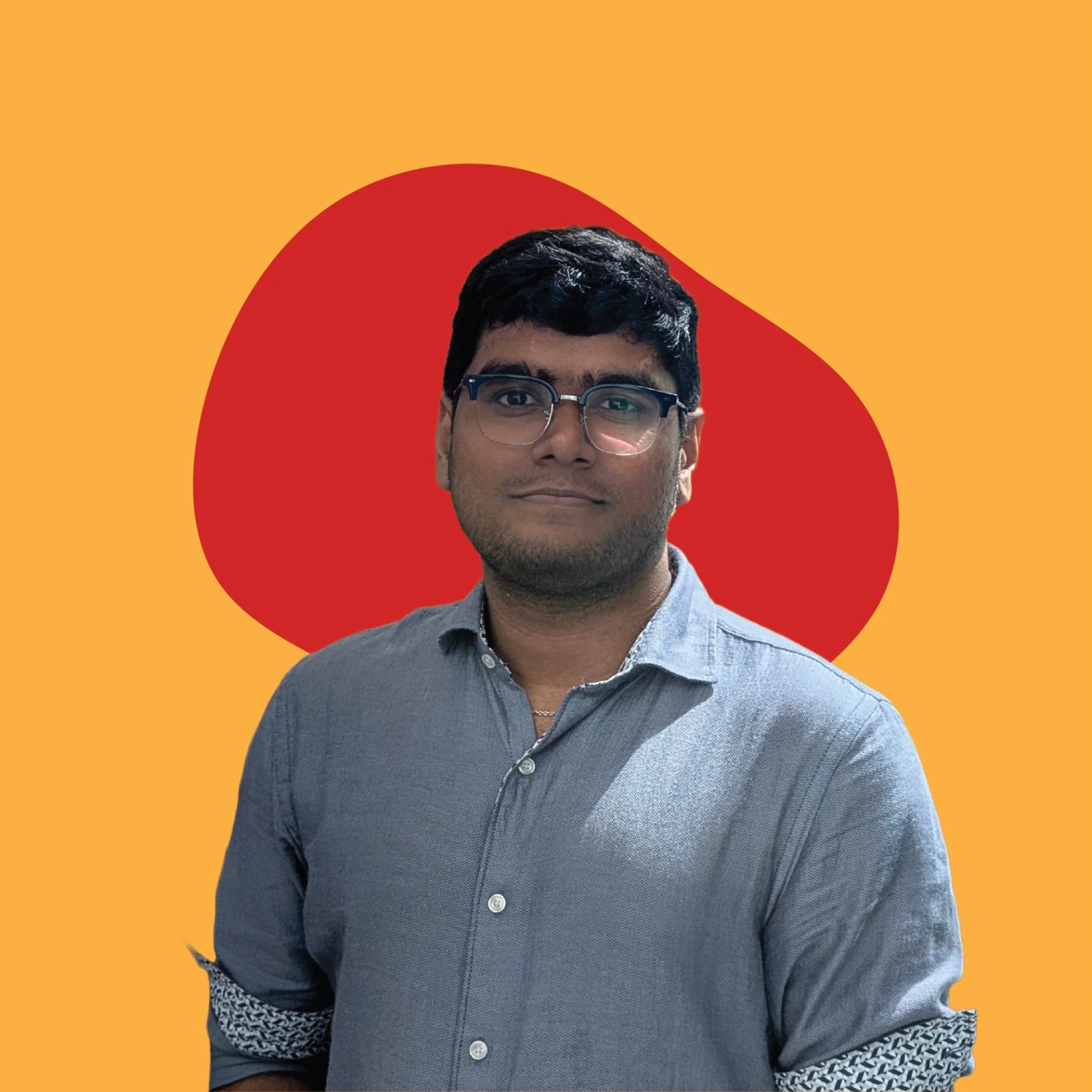
Portrait of Ankur Mishra in glasses and a blue button-up shirt, in front of a red shape

Get in touch.

+1 510 5135368

ankur1999.mishra@gmail.com

San Ramon, California